I think it’s something I got from my mom, but I love maps. As a child, I remember her excitedly poring over them and talking her way through them—whether tracing and explaining to us the journeys of Paul the Apostle or planning our next family vacation.
Before the days of Google maps—and even MapQuest (remember that one?)—she’d unfold the big maps all over the kitchen counter, a Frommer’s Travel Guide or two at her side, and plot out our course.
Now an adult myself, I’m usually the one with the map whenever I travel with a group. Give me a good, old-fashioned fold-up pocket map as my guide to a foreign city, and we’re good to go. Let’s have an adventure… Let’s discover something.
But even without stepping foot outside the door, maps can help us discover so much about the world, and that’s why I find myself so captivated by them.
When I come across a good map or pictorial explanation of some facts or stats relevant to poverty, global health, or some other work we do at Bright Hope, there’s a good chance I’ll be sending out the link to my coworkers because it’s just. So. Cool.
So this time I decided to share a few really great ones with you too…
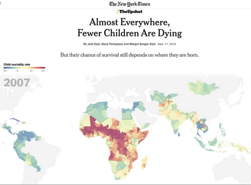
ALMOST EVERYWHERE, FEWER CHILDREN ARE DYING
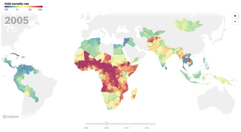
This one by the New York Times is incredible and oh so encouraging. It’s an animated color-coded timeline that shows how the number of children who die before their 5th birthday has been almost cut in half in the in the last 20-ish years. Incredible. Really, it’s worth the click. (There’s some great info and supplemental maps in the article too.)
MORE PEOPLE LIVE INSIDE THIS CIRCLE THAN OUTSIDE OF IT
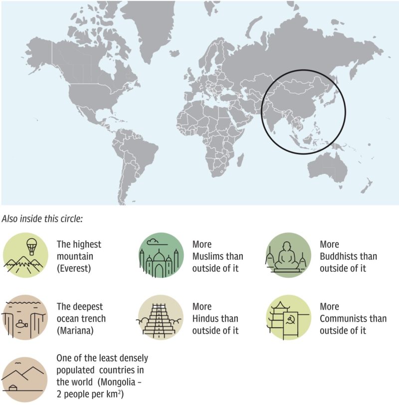
Whaaaaaaat?!?!? Seriously? Still trying to wrap my brain around that one. The Telegraph published this article about a guy named Ian Wright (@brilliantmaps) who loves maps more than I do and has collated some unique ones into a book. Click on the link to see some other nifty ones (including some with great random pieces of information such as “Countries that have no McDonald’s,” and another one that explains who and why some countries drive on the “wrong” side of the road).
THE TRUE SIZE OF AFRICA
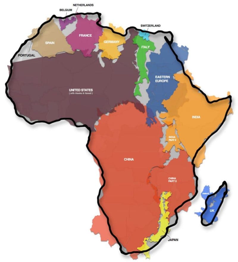
Again, mind-boggling, right? Unofficially speaking, it looks like most of the world fits in Africa. I knew it was big…but THAT big? Wow.
MAPPING EXRTEME POVERTY AROUND THE WORLD
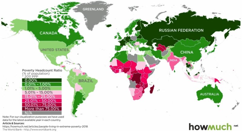
This one is sad, but so, so helpful. We’re always talking about “the extreme poor” and “those who live on less than $2 a day,” but those are big concepts to really grasp in our minds. This visualization is easy to understand, crystalizing the information and helping me process it in a snap.
There are lots more I could share, but this is already getting long. What do you think? Did you learn anything? Anything strike you?
If you have any maps you like, I’d sincerely LOVE to see them. Please send them my way at blog@brighthope.org.
Keep discovering!